2.9. Descriptive Statistics
In practice the probability (density) functions are seldomly known. We just have a lot of data that we think come from one distribution. Almost always we assume the data values are independent realizations of the same random variable.
What we would like to do in many cases is to estimate the probability (density) function of the underlying random variable. Here we assume that the random variable is a continuous one. So the problem is: given the observations
The indexing with a superscript may strike you as a little odd but it is quite common in machine learning where sometimes a lot of indices are needed to identify an object. We use parentheses not to confuse \(x^2\) with \(x^2\) (sic!).
2.9.1. Histograms
A first step in any statistical or machine learning tasks is to get to know your data. The simplest way to get an overview of all possible values in the dataset \(x\ls i\) is to make a histogram of the data.
A histogram is a visual representation of a frequency table. For continuous data first we divide the value range \(\setR\) into bins (intervals) and then we count how many of the observation \(x\ls i\) are within each bin. The bins are chosen such that they cover the entire range of values in the data set without overlap and that the bins are contiguous.
We then make a histogram of the bin values. Note that for a histogram of continuous data the bars in the plot should have no space inbetween them.
Note that the choice for the bins is somewhat arbitrary. In case you select to few bins you can not assess the distribution of values in your dataset. But in case of too many bins (i.e. a bin width that is very small) you will probably end up with 0 or 1 data value in bins.
There are methods to select the bin width given the size of the data set and also methods that look at statistics of the data. We strongly
suggest you experiment with the bin width.
In [1]: from matplotlib.pylab import *

In [2]: from sklearn import datasets

In [3]: bc = datasets.load_breast_cancer()

In [4]: x = bc.data[:,0]

In [5]: y = bc.target

In [6]: x0 = x[y==0]

In [7]: x1 = x[y==1]

In [8]: be = linspace(x.min(), x.max(), 50)

In [9]: h0, _ = histogram(x0, bins=be)

In [10]: h1, _ = histogram(x1, bins=be)

In [11]: bar(be[:-1],  h0, be[1]-be[0], color='r', alpha=0.5);

In [12]: bar(be[:-1],  h1, be[1]-be[0], color='g', alpha=0.5);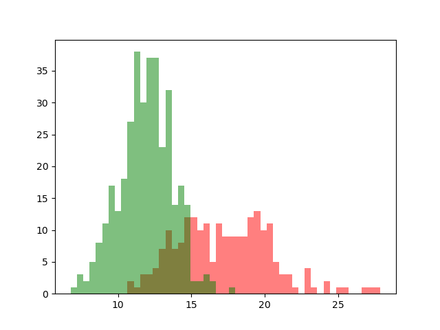
In the figure above the histograms of two datasets are drawn. The data is taken from a study into breast cancer. The feature value is the mean radius of a spot on the mammography. The red histogram is of malignant spots, the green histogram of benign spots.
This plot shows the central problem in machine learning: one feature of objects is most often not enough to classify the objects without error as can be seen by the fact that the two histograms overlap. More features are needed and even then there will probably be cases where classification will be wrong.
2.9.2. Statistics
The most well known statistics of a set of numbers are the mean and the variance. The mean simply is:
and the variance is
The square root of the variance \(s\) is called the standard deviation.
Carefully note the difference between the expectation and variance of a distribution and the mean and variance of a data set. It is true that in the limit where \(m\rightarrow\infty\) the two are equal. But in general \(m\) and \(s^2\) are only estimates of \(\E(X)\) and \(\Var(X)\).
There are many more statistics that can be calculated given a data set of values. Alternatives for the mean are the mode or the median. Alternatives for standard deviation (measure of spread) are quartile distances among others.