Chapter 9 Introduction to plotting in R
For plotting data in R you have two main options. You can either use the plotting functions that come installed with base R (base R plotting), or use a speciallized plotting library for plotting called “ggplot”, for which you need to install a package (ggplot2) in R. In general base R is easier to use for very simple plots, but as the plots get more complicated (for example you have multiple independent variables), using ggplot can save you some time. Feel free to use whichever tool you want throughout the class.
9.1 Introduction to Base R plotting
Base R plotting functions work directly with R’s data structures, such as vectors and data frames, allowing for quick and easy creation of basic plots. Base R plotting is particularly useful for those who are new to R or those who need to create plots quickly without the overhead of learning additional packages. It serves as a solid foundation for data visualization.
9.2 Introduction to ggplot2
ggplot2 is a powerful and versatile plotting system in R, known for its ability to produce aesthetically pleasing and complex graphics with relatively simple commands. Developed by Hadley Wickham, it’s based on the grammar of graphics—a coherent system for describing and building graphs. Here are some key concepts and features of ggplot2:
Layered Approach: ggplot2 uses a layered approach to build plots. You start by defining the data and mappings between variables to aesthetics (like color, size, and shape), and then you add layers of graphical objects (like points, lines, and bars).
Aesthetic Mappings: In ggplot2, you map data to visual properties (aesthetics) of geometric objects (geoms). For example, you might map the ‘height’ variable to the y-axis and ‘gender’ to the color aesthetic.
Geometric Objects (Geoms): These are the actual shapes or objects that are plotted. Common geoms include geom_point (for scatter plots), geom_line (for line plots), and geom_bar (for bar plots).
Statistical Transformations (Stats): These are used to transform data before it’s plotted. For example, stat_summary can be used to plot summaries (like means) directly.
Scales: Scales map values in the data space to values in an aesthetic space, whether it be color, size, or shape. They also provide tools for formatting tick marks, labels, and legends.
Coordinate Systems: By default, ggplot2 uses Cartesian coordinates, but you can also use polar coordinates, or set up a map projection.
Faceting: Faceting allows you to create multiple plots based on a categorical variable. It’s a powerful tool for breaking down complex data into manageable chunks.
Themes: ggplot2 allows extensive customization of plots through themes, where you can modify text, labels, legends, and other plot elements.
Here’s a basic structure for a ggplot2 command:
ggplot(data = <DATA>, aes(x = <X_VARIABLE>, y = <Y_VARIABLE>)) + <GEOM_FUNCTION>(additional parameters) + ... (other layers, scales, and theme adjustments)
9.3 Plotting continuous X and Y Data
# Sample Data
set.seed(12) # for reproducible data
x_data <- runif(10)
y_data <- 1 + 2 * x_data + rnorm(10,0,.5)

data = data.frame(x_data,y_data)
9.3.1 With Base R
Base R provides several functions for plotting continuous data, allowing you to create a variety of plots such as scatter plots, line plots, and more. Unlike ggplot2, base R graphics are generally less verbose and offer a straightforward approach for quick and simple plots. Here’s an overview of plotting continuous X and Y data using base R:
Scatter Plots: The plot() function is the most basic and versatile plotting function in base R. It creates a scatter plot by default, which is ideal for visualizing the relationship between two continuous variables.
# Scatter plot
plot(x_data, y_data,
     main = "Scatter Plot",
     xlab = "X-axis Label",
     ylab = "Y-axis Label",
     pch = 19, col = "blue")
Adding Trend Lines: You can add trend lines to your scatter plots using functions like abline() (for linear models), lines() (for non-linear models), or smooth.spline() (for smoothed lines).
# Scatter plot with a linear trend line
plot(x_data, y_data, main = "Scatter Plot with Trend Line")
model <- lm(y_data ~ x_data)
abline(model, col = "blue", lwd=3)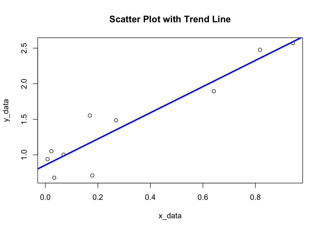
9.3.2 With ggplot2
We can plot the relationship between two continous variables in ggplot as follows:
library(ggplot2)
# Scatter plot in ggplot2
ggplot(data, aes(x = x_data, y = y_data)) +
geom_point() +
labs(title = "Scatter Plot with Trend Line",
x = "X-axis Label",
y = "Y-axis Label")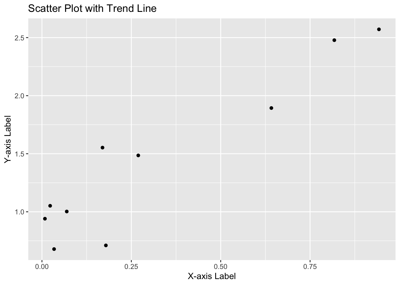 We can also plot a line to represent the linear model that relates x to y:
# Scatter plot with a trend line in ggplot2
ggplot(data, aes(x = x_data, y = y_data)) +
  geom_point() +
  geom_smooth(method = "lm", color = "blue") + # 'lm" fits linear model to model y as function of x
  labs(title = "Scatter Plot with Trend Line",
       x = "X-axis Label",
       y = "Y-axis Label")
9.4 Plotting categorical X and continuous Y
This tutorial demonstrates how to plot data with categorical X-axis and continuous Y-axis using both base R and ggplot2.
9.4.2 With Base R
Using base R, we can create a boxplot, which is a common way to visualize data distribution across categories.
# Base R plot
boxplot(values ~ category, data = data,
        main = "Boxplot in Base R",
        xlab = "Category",
        ylab = "Values",
        col = rainbow(length(categories)))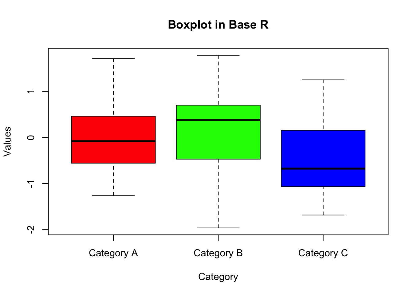
9.4.3 With ggplot2
Below I show I couple options for plotting data with categorical independent variables.
One option is to use a box plot, like in Base R:
# Loading the ggplot2 package
library(ggplot2)

# ggplot2 plot
ggplot(data, aes(x = category, y = values)) +
  geom_boxplot(fill = rainbow(length(categories))) +
  labs(title = "Boxplot with ggplot2",
       x = "Category",
       y = "Values")
In addition to boxplots, ggplot2 allows for the plotting of individual data points. This can provide a more detailed view of the data distribution.
# ggplot2 plot for points
ggplot(data, aes(x = category, y = values)) +
  geom_point(color = "blue", size = 3, alpha = 0.6) +
  labs(title = "Point Plot with ggplot2",
       x = "Category",
       y = "Values")
When there are multiple data points for each category, using jitter (adding a small amount of noise to the points) can help avoid overplotting and make the plot more informative.
# ggplot2 plot with jitter
ggplot(data, aes(x = category, y = values)) +
  geom_jitter(color = "red", size = 3, width = 0.1) +
  labs(title = "Jitter Plot with ggplot2",
       x = "Category",
       y = "Values")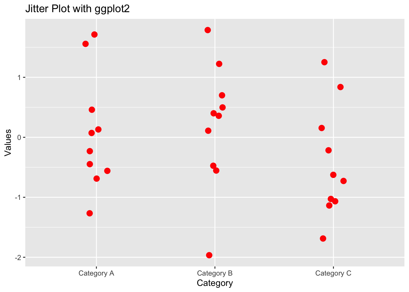
We can also add additional graphic layers, for exaple plot the means for each group in addition to the individual data points:
# Calculate means
means <- aggregate(values ~ category, data = data, mean)

# ggplot2 plot with jitter and mean
ggplot(data, aes(x = category, y = values)) +
  geom_jitter(color = "red", size = 3, width = 0.2, alpha=.5) +
  geom_point(data = means, aes(x = category, y = values),
             fill = "red", size = 5,shape =21) +
  labs(title = "Jitter Plot with Means",
       x = "Category",
       y = "Values")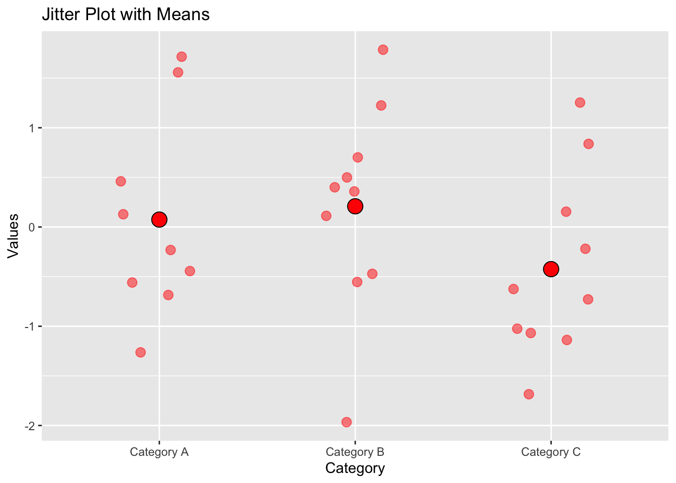
9.5 Data with a catagorical and continuous independent variable
Suppose you have a dataset with variables x_data, y_data, and a factor group which has two levels (e.g., “Group 1” and “Group 2”).
# Example dataset
set.seed(123) # For reproducible results
x_data <- rnorm(100)
group <- sample(c(0, 1), 100, replace = TRUE)

y_data <- 3 * group + 1 * x_data + rnorm(100)

data <- data.frame(x_data, y_data, group)
9.5.1 With Base R
In base R, you can use the plot() function and then add the points for the second group using points() or lines() for a different visual representation:
# Base R plot with groups
y_limits = c(min(y_data), max(y_data))

plot(y_data ~ x_data, data = data[data$group == 0,],
     col = "blue", pch = 16,
     main = "Scatter Plot with Groups",
     ylim = y_limits,
     xlab = "X Data", ylab = "Y Data")

points(y_data ~ x_data, data = data[data$group == 1,],
       col = "red", pch = 17)
In this code:
pch specifies the type of symbol used in the plot (e.g., circles, triangles).
col changes the color of the points.
The firstplot()call plots data for "Group 1", and thenpoints()` adds data for “Group 2”.
9.5.2 With ggplot2
Using ggplot2, this becomes more straightforward, as ggplot2 automatically handles the grouping when you map the group variable to a visual property like color or shape:
# ggplot2 plot with groups
library(ggplot2)

ggplot(data, aes(x = x_data, y = y_data, color = factor(group))) +
  geom_point() +
  labs(title = "Scatter Plot with Groups",
       x = "X Data", y = "Y Data")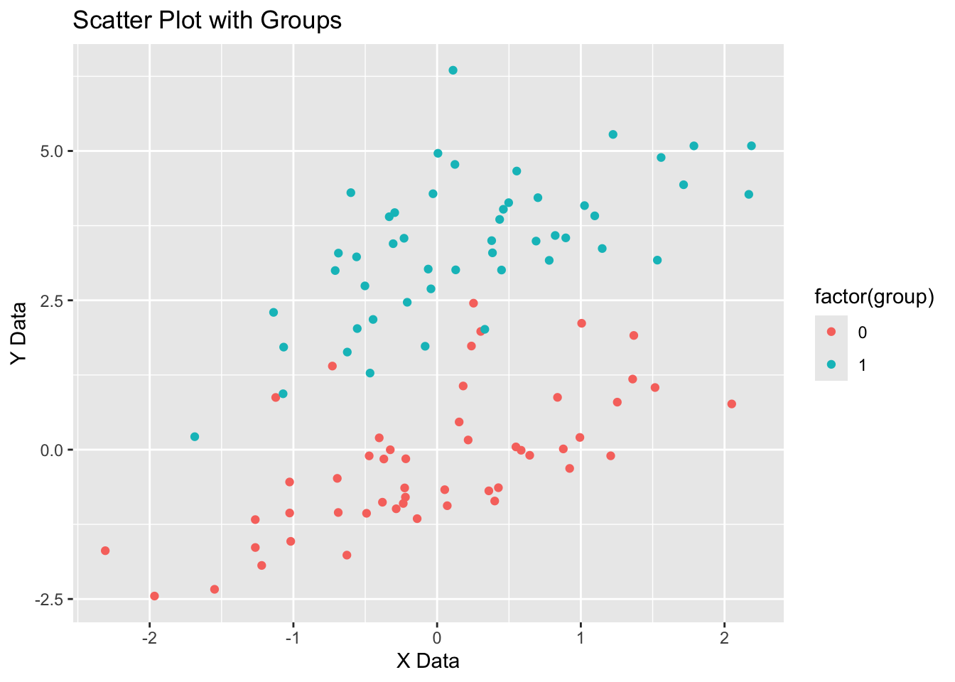
9.6 Using different themes in ggplot2
If you don’t like the grey background in default ggplot plots, you can experiment with different themes to create plots with different settings. I like to use theme_cowplot(). To use it you have to install the package (if you don’t have it) and then import it.
# if you haven't installed cowplot yet, run the line of code below:
#install.packages("cowplot")

library(cowplot)

ggplot(data, aes(x = x_data, y = y_data, color = factor(group))) +
  geom_point() +
  labs(title = "Scatter Plot with Groups",
       x = "X Data", y = "Y Data") +
  theme_cowplot()