1.7. Image Histograms
1.7.1. Univariate Histogram
A histogram of all possible scalar pixel values in an image provides a summary of the distribution of the values over all possibe values:
where \([ \text{condition}]\) is 1 in case the condition is true and
zero otherwise. Such a ‘condition bracket’ is called an Iverson
bracket 2. Here \(e_i\) for \(i=0,\ldots,k\) are the bin
edges in the histogram. The histogram value \(h_f[i]\) is calculated for
\(i=0,\ldots,k-1\). The formula above is what the histogram
function from numpy is calculating. Please read the documentation to
read in what way you can determine the number of bins and the bin
edges that are being used.
Observe carefully that the histogram function automagically
chooses \(e_0\) to be equal to the minimal value of \(f\) and \(e_n\) to be
equal to the maximal value. In most cases that is ok, but in case you
want to compare histograms of several images you better choose your
bin edges equal across all images.
Choosing an appropriate bin size is more of an art than a science. There simply is no best number of bins. As a consequence many rules of thumb exist. A well known one is Sturges’ rule that selects the number of bins \(k\) as:
Nowadays Numpy also has the function histogram_bin_edges that
allow for the use of many of these rules of thumb to define the
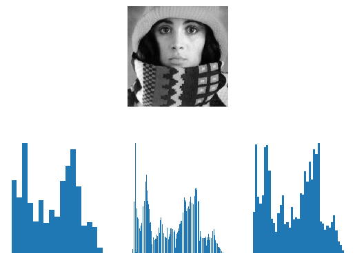
bins. Below we give visual representations of histogram of all gray
values in an image using several of these rules. Please look at the
code below to see what rules are being used (on the left the ‘Sturges
histogram’) and look into the documentation to learn more about these
rules.
Show code for figure
 1import numpy as np
 2import matplotlib.pyplot as plt
 3
 4f = plt.imread('source/images/trui.png')
 5plt.subplot(232)
 6plt.imshow(f, cmap='gray')
 7plt.axis('off')
 8
 9be = np.histogram_bin_edges(f, bins='sturges')
10h, be = np.histogram(f, bins=be)
11plt.subplot(234)
12plt.bar(be[:-1], h, be[1]-be[0], align='edge')
13plt.axis('off')
14
15be = np.histogram_bin_edges(f, bins='sqrt')
16h, be = np.histogram(f, bins=be)
17plt.subplot(235)
18plt.bar(be[:-1], h, be[1]-be[0], align='edge')
19plt.axis('off')
20
21be = np.histogram_bin_edges(f, bins='fd')
22h, be = np.histogram(f, bins=be)
23plt.subplot(236)
24plt.bar(be[:-1], h, be[1]-be[0], align='edge')
25plt.axis('off')
26
27plt.savefig('source/images/scalar_histogram.png')

Fig. 1.22 Scalar Histograms. In the top row the image is shown and on the bottom its histogram for three different rules to set the number of bins. Observe that that there is quite some difference in number of bins and hence in the appearance of the histogram. Remember there is no ‘true’ histogram.
1.7.2. Multivariate Histograms

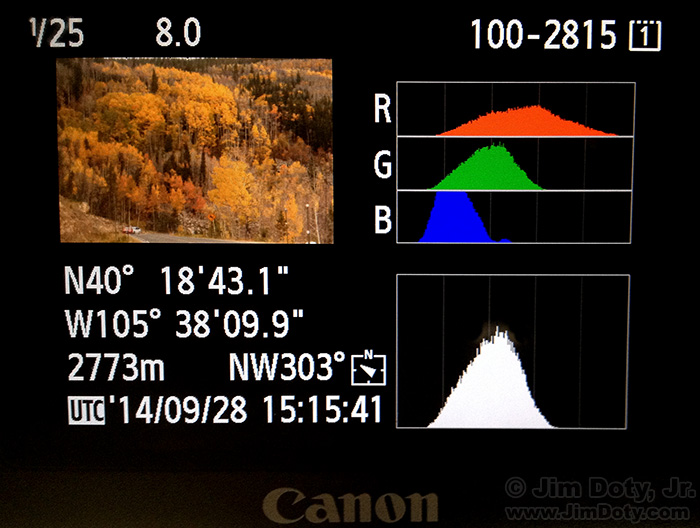
Fig. 1.23 Histogram display on a modern camera. Note that four histograms are shown: for all three color channels and for the luminance channel (which looks much like the histogram for the green channel).
Now assume that your data to be histogrammed is d-dimensional, e.g. a color image where \(d=3\). You could make univariate histograms of the three colors R, G and B but then the correlation of the colors is not captured in the histogram (see Fig. 1.23). It is best to make a real three dimensional histogram with three dimensional bins. Every bin this is a rectangular 3D volume. Let \(\v f(\v x)\) be a color image:
The histogram then is:
The product of the ‘condition brackets’ (called Iverson brackets) is one only in case \(\v f(\v x)\) is within the 3D bin with indices \((i,j,k)\).
A multivariate histogram can be calculated with the histogramdd
function from numpy. Evidently visualizing a 3D (or even higher
dimensional) histogram is not a trivial task. Here we give a very
simple way to do so. 1
def histogram3dplot(h, e, fig=None):
    """
    Visualize a 3D histogram

    Parameters
    ----------

    h: histogram array of shape (M,N,O)
    e: list of bin edge arrays (for R, G and B)
    """
    M, N, O = h.shape
    idxR = np.arange(M)
    idxG = np.arange(N)
    idxB = np.arange(O)

    R, G, B = np.meshgrid(idxR, idxG, idxB)
    a = np.diff(e[0])[0]
    b = a/2
    R = a * R + b

    a = np.diff(e[1])[0]
    b = a/2
    G = a * G + b

    a = np.diff(e[2])[0]
    b = a/2
    B = a * B + b

    colors = np.vstack((R.flatten(), G.flatten(), B.flatten())).T/255
    h = h / np.sum(h)
    if fig is not None:
        f = plt.figure(fig)
    else:
        f = plt.gcf()
    ax = f.add_subplot(111, projection='3d')
    mxbins = np.array([M,N,O]).max()
    ax.scatter(R.flatten(), G.flatten(), B.flatten(), s=h.flatten()*(256/mxbins)**3/2, c=colors)
    ax.set_xlabel('Red')
    ax.set_ylabel('Green')
    ax.set_zlabel('Blue')
Show code for figures
 1from skimage.io import imread
 2from ipcv.ip.histogram3dplot import histogram3dplot;
 3plt.close('all')
 4
 5f = imread('python/data/images/peppers.png')
 6plt.figure(1);
 7plt.imshow(f);
 8plt.savefig('source/images/ peppersdisplay.png')
 9
10h, e = np.histogramdd(f.reshape(-1,3), bins=8)
11histogram3dplot(h, e)
12plt.savefig('source/images/colorhistogram.png')

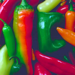
Fig. 1.24 Color Image.

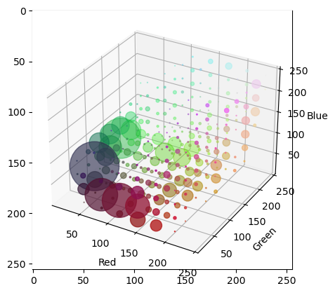
Fig. 1.25 3D Histogram of Color Image.
In the above 3D histogram display the histogram is 8x8x8 bins. The bins are 3D cubes. At the RBG position of each bin we display a disk like marker in the color corresponding with the color in the RGB space and with a radius that is proportional to the histogram count.
The histogram visualization shows that there are a lot of reddish and greenish pixels in the image and that there are a lot of dark blueish pixels (the darker spots in between the peppers).
When you run the program yourself you can rotate the plot by clicking and dragging. Then it is easier to see the distribution of colors in the RGB cube.
Visualizing a 2D histogram is much easier: \(h_f[i,j]\) can be
visualized as a scalar image. Numpy has a function histogram2d
just for 2D data: please read the documentation carefully.
Footnotes
- 1
It would be much nicer to have a color histogram visualization where the ‘markers’ are really 3D markers. For instance cubes of the color corresponding with their position in the RGB cube and a volume proportional to the number of counts. An implementation in OpenGL would be best of course. Any volunteers?
- 2
The Iverson bracket was introduced by Kenneth E. Iverson. Read the nice intro on Wikipedia. Iverson is the inventor of the computer language APL being the precursor of all array processing languages like Numpy/Python and Matlab.