1.2.1. Plotting Signals
1.2.1.1. Plotting Real Valued Signals
Consider a CT signal \(x(t)\). A real valued CT signal is plotted using the standard ways to plot a function \(x: \setR \rightarrow \setR\). Consider the sinusoidal signal \(x(t)=325 \sin(2\pi 50 t)\) for a short interval of time we can plot this as:
Show code for figure
 1import numpy as np
 2import matplotlib.pyplot as plt
 3
 4plt.clf()
 5
 6t = np.linspace(-0.02, 0.05, 1000)
 7plt.plot(t, 325 * np.sin(2*np.pi*50*t));
 8plt.xlabel('t');
 9plt.ylabel('x(t)');
10plt.title(r'Plot of CT signal $x(t)=325 \sin(2\pi 50 t)$');
11plt.xlim([-0.02, 0.05]);
12plt.savefig('source/figures/sineplot.png')
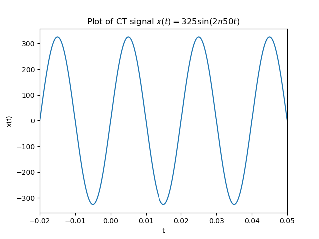
Fig. 1.5 Real valued CT function plot.
Evidently the above plot is a lie. You cannot plot a CT signal on a digital device. In Computer Graphics class you have or will learn that a function (signal) is plotted as a chain of straight lines (and even the straight lines are discretized as a set of dots—the pixels—on the screen). But it sure looks like a CT signal doesn’t it?
Things are different when we consider a DT signal. Given the values of \(x[n]\) for say \(n=0\) to \(n=100\) we could use the same strategy and plot it as we did for the CT signal: just connect the dots \((n, x[n])\). That is done in practice often. However in these notes when dealing with the differences between CT and DT signals we want to stress that a DT signal essentially is just a sequence of numbers. There is no need to think about \(x[n+0.2]\) in the discrete domain and certainly no need to visualize it.
Therefore a DT signal is plotted as a sequence of vertical bars. A stem plot:
Show code for figure
1plt.clf()
2n = np.arange(50);
3dt = 0.07/50
4x = np.sin(2 * np.pi * 50 * n * dt)
5plt.xlabel('n');
6plt.ylabel('x[n]');
7plt.title(r'Plot of DT signal $x[n] = 325 \sin(2\pi 50 n \Delta t)$');
8plt.stem(n, x, use_line_collection=True);
9plt.savefig('source/figures/dtsineplot.png')
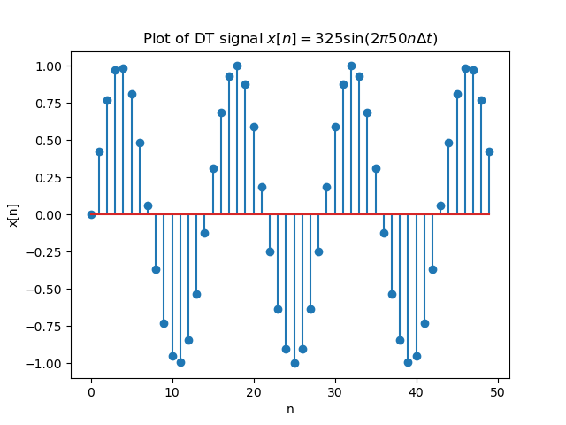
Fig. 1.6 Real valued DT function plot.
Note that in case we want to visualize a DT signal (say sound signal) with very many samples (thousands and more) we most often visualize the signal as if it were a CT signal. Only when the number of samples is small enough a stem plot will be used.
1.2.1.2. Plotting Complex Valued Signals
Now consider the complex valued CT signal:
Plotting such a signal as if it were a real valued signal results in a Python warning that complex numbers are casted to real by discarding the imaginary parts. There are several ways to visualize a complex valued signal. The first one plots both the real and imaginary parts of the signal.
Show code for figure
 1plt.clf()
 2t = np.linspace(-0.02, 0.05, 1000)
 3fig, (axreal, aximag) = plt.subplots(nrows=2, sharex=True);
 4axreal.plot(t, np.exp(2j*np.pi*50*t).real );
 5axreal.set_xlabel('t');
 6axreal.set_ylabel('Re x(t)');
 7#plt.title(r'Real part of  \$x(t)=e^{j 100 \pi t}\$');
 8axreal.set_xlim([-0.02, 0.05]);
 9
10#plt.subplot(212, sharex=ax1);
11aximag.plot(t, np.exp(2j*np.pi*50*t).imag );
12aximag.set_xlabel('t');
13aximag.set_ylabel('Im x(t)');
14#plt.title(r'Imaginary part of  \$x(t)=e^{j 100 \pi t}\$');
15plt.savefig('source/figures/csineplot.png')
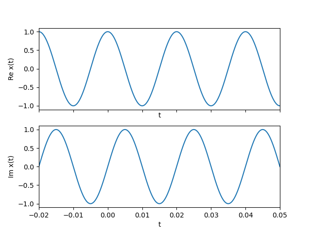
Fig. 1.7 Complex valued CT function plot. Plotted are the real (top) and imaginary (bottom) part of the function \(x(t) = \exp(j 100\pi t)\).
Instead of plotting the real and imaginary part of a complex signal, we can also plot the magnitude and angle of the complex values.
Show code for figure
 1plt.clf()
 2t = np.linspace(-0.02, 0.05, 1000)
 3fig, (axreal, aximag) = plt.subplots(nrows=2, sharex=True);
 4axreal.plot(t, np.abs(np.exp(2j*np.pi*50*t)) );
 5axreal.set_xlabel('t');
 6axreal.set_ylabel(r'$|x(t)|$');
 7axreal.set_xlim([-0.02, 0.05]);
 8
 9aximag.plot(t, np.angle(np.exp(2j*np.pi*50*t)));
10aximag.set_xlabel('t');
11aximag.set_ylabel(r'$\angle x(t)$');
12plt.savefig('source/figures/absanglesineplot.png')
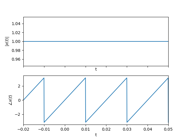
Fig. 1.8 Complex valued CT function plot. Plotted are the absolute value (magnitude) and phase (angle) part of the function \(x(t) = \exp(j 100\pi t)\).
Note that both plots of the complex signal are equivalent. They both do represent the same signal. Also note the seemingly strange behaviour of the phase (angle) plot. It looks quite discontinuous. But it is really not because the phase jumps from +180 degrees to -180 degrees and that is of course the same angle! This phenomenon will be seen quite a lot when plotting the phase of complex signals and functions. It is called phase wrapping. If we would allow angles outside the range from -180 to +180 we could obtain a perfectly straight line (doing just that is called phase unwrapping).